A real estate agency with exceptional properties.

The identity is an aesthetic refresh of their existing logo with a new font, new proportions, new colors.
A stronger brand image and a new baseline, “Quality is not a standard, it's an attitude”

Stages of evolution of their rebranding
. The line was placed at the bottom to create a real estate shape with the lines.
. The logo now fits in a square to be used on all media and formats.
. Improved readability while keeping the choice of pre established typographic style.


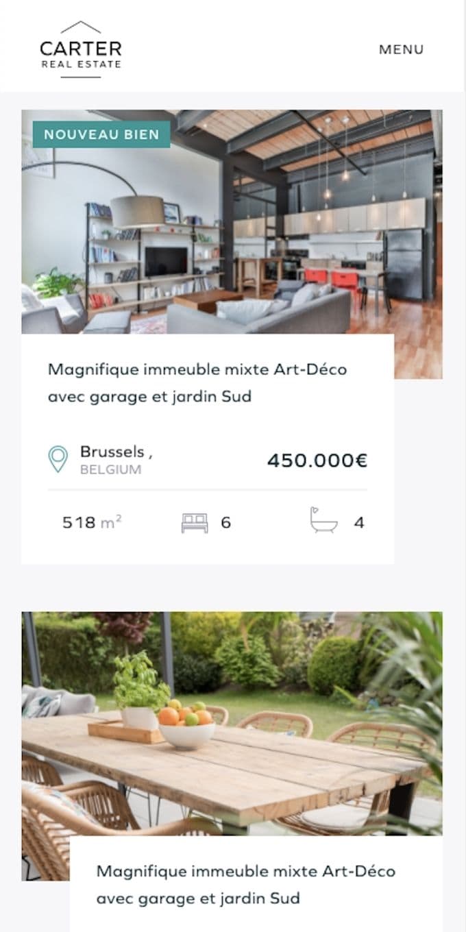
The website is one of the first sites we have made with a Jamstack approach. Indeed the content comes from an admin and the real estates come from their ERP. The serverless approach in this case allows incredible performance compared to excisting solutions on the market where the website makes a distant query at every display.